
How to Wear Prints and Patterns in Family Pictures
One challenge that seems to come up time and time again is how to wear prints and patterns in family pictures. And understandably so. It can be tricky. Choose a bold pattern and all the attention is drawn to that person. Too many people wearing a pattern and your portrait ends up busy. One person in a pattern? That person ends up looking like they don’t fit in.
Working with patterns
When choosing prints and patterns in your outfits for family pictures, it can help to choose patterns that are subtle. Think plaids that are various shades of blue rather than white and blue checked. Or a floral print in muted tones rather than a vibrant print. Tone on tone stripes or a polka dot that is just a hint lighter than the background color also offer subtle ways to incorporate patterns in your family pictures.
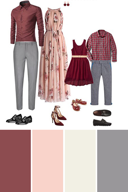
Since they are subtle, they won’t draw as much attention to the person wearing. But they still help by adding visual interest. The summer wardrobe above is a great example of this. Mom’s dress is in muted tones. And the little boys shirt is checkered. But the gray and burgundy are so close in tone that when you step back, it almost appears solid.
Fashion tip: Prints and patterns create visual interest in portraits. Opting for softer tone on tone prints help to create an image where everyone is balanced and one single person doesn’t become a focal point.
Would You Like More What to Wear Tips?
Take a peak at our Ultimate What to Wear Guide for Family Photos or follow my Pinterest Board full of family outfit inspirations.

